Flexbox: Practical Examples

Buy ebook

CSS Mine

Get my e-book focusing on CSS3 and
modern web UI development.

Learn more

First Example: Flexibility Basics

Take this HTML:

<label>
  <input type="radio"> Lorem ipsum dolor
  sit amet, consectetur adipisicing
  elit error quo
</label>

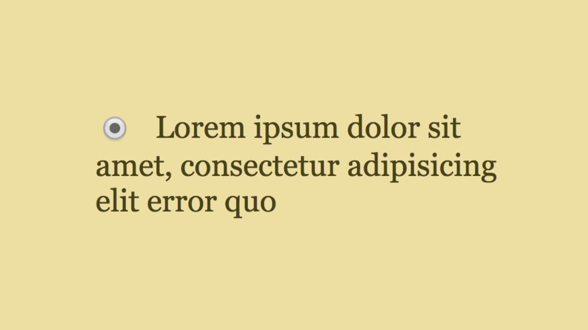
This will not be aligned nicely in a browser, so do not expect a pat on the back from your client:

Unaligned text

We do not want the text to overflow the radio button. We can avoid that without using flex box, however if we do use flexbox, it will be almost ridiculously simple. All you need is the following declaration:

label { display: flex }

This turns our <label> into a flexbox container and its direct children into flexbox items.

You can clearly see that an empty text node (i.e. text not wrapped in a div) can be considered a flexbox item. In our case, this is the “Really long caption…”.

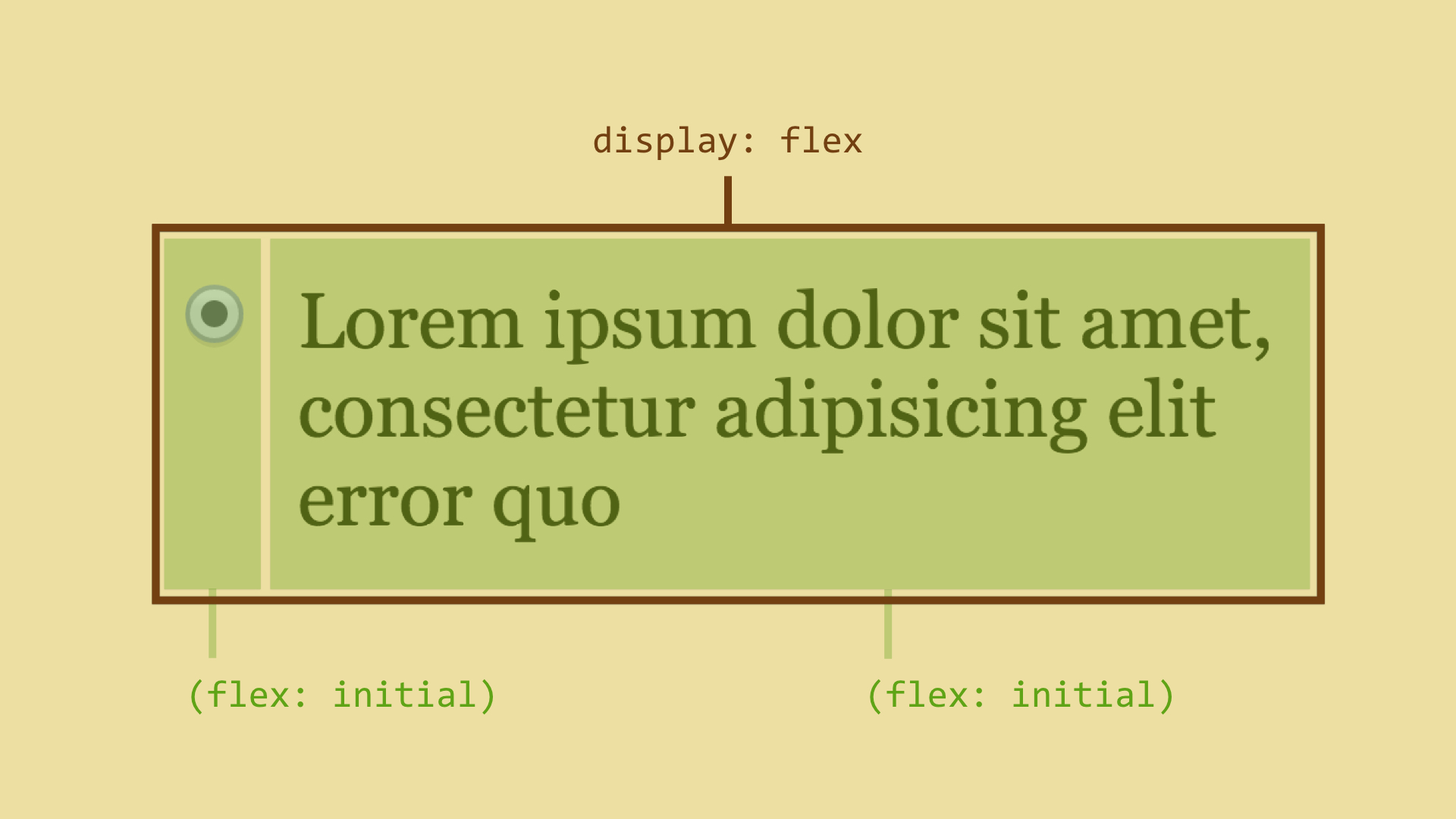
Now let’s display this situation in an image:

flexible button

Technically speaking, every item has a flex property and a default value set to initial. As you will learn from the “Flexbox Reference Guide”, the flex property is shorthand for additional properties. The initial value means that an item can shrink when there is not enough space, however, it will not extend to fill up extra space.

You can try an example at CodePen: http://cdpn.io/e/raqXZX.

Second Example: Combining Units

combining units

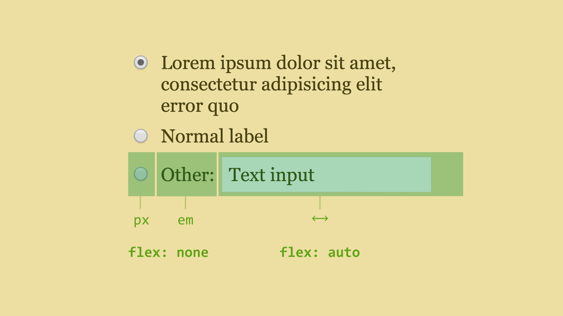
Let’s extend our example. Take a look at the last line in the picture, where we combine various units.

We want to define the width of the radio button in pixels, however, the width of the caption depends mainly on the font size, so we want to use em units. Also, we want the text input to fill up the rest of the space. At the same time, we do not want to change the size of the caption. This is easy when using flexbox. The browser will handle the combination of units.

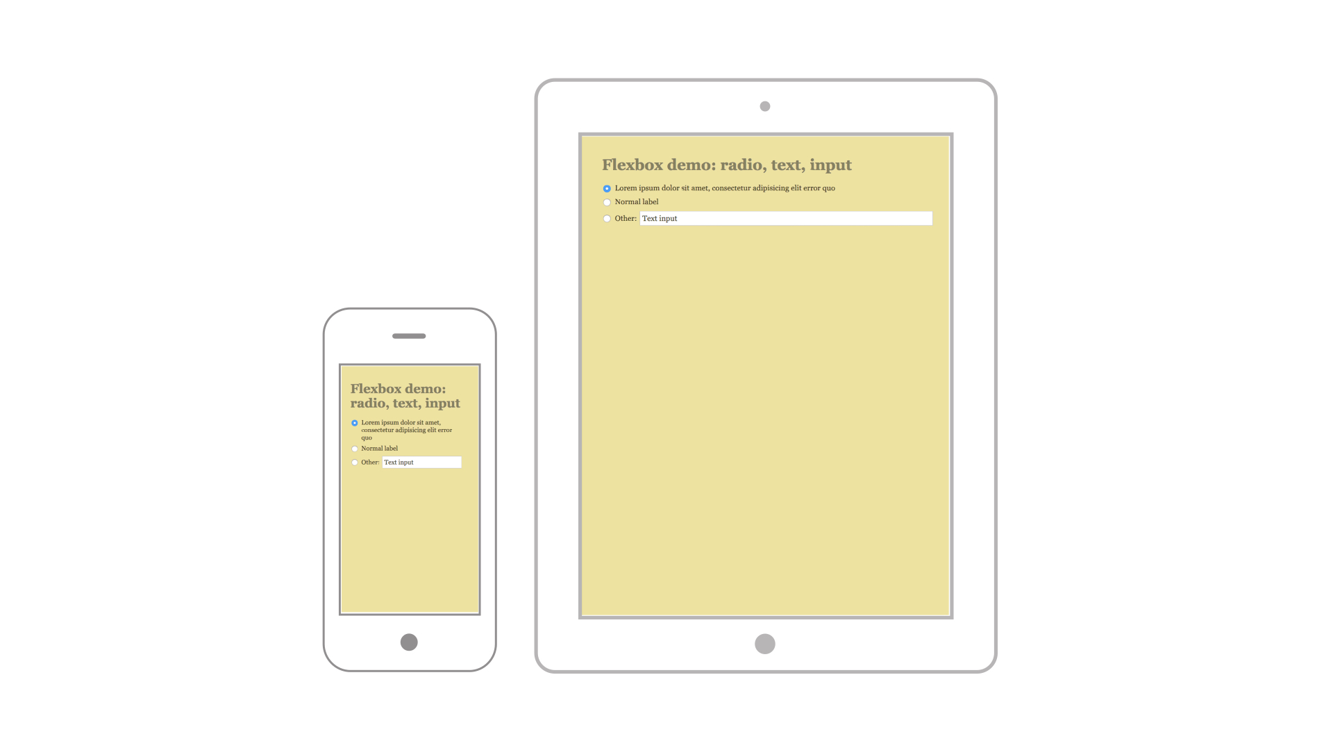
combining units using different window sizes

Notice that we set flex: none for the radio button and text because we do not want them to shrink or extend. They simply keep the same width at all costs. On the other hand, by using flex: auto, we forced the text field to shrink or extend based on the parent’s width.

Try an example at CodePen: http://cdpn.io/e/jEJbmg.

Third Example: Vertical Centering of a Box with Unknown Height

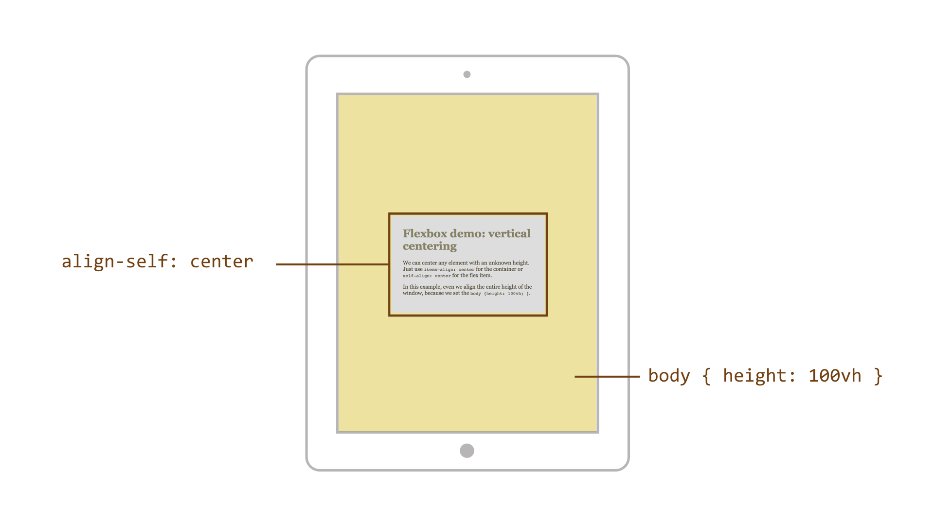
centering

Have you struggled with this problem too? Stop struggling, use flexbox. We will turn <body> into a flex container and using a new vh unit, we will resize it to 100% of the browser window. Then all you need to do is tell the flex item to center itself using the align-self property.

Both vertical and horizontal centering using flexbox is literally trouble-free. Take a look at the justify-content and align-items properties in addition to the align-self property, when reading the “Flexbox Reference Guide”.

Try an example at CodePen: http://cdpn.io/e/zxydom.

Fourth Example: Changing the Visual Order of Items

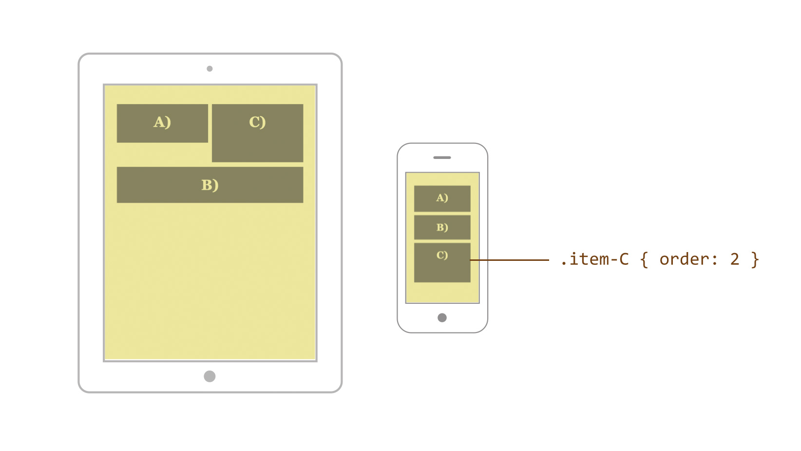
If you need to set an order of items in HTML one way and display it another way, flexbox will help you. Just remember the order property, which is used to change the order of flex items.

order change

Let’s define the HTML order: A) C) B). And let’s assume we want to change that order on small screens so that B) will be followed by C). Since the order property counts from zero, we will do it this way:

.item-C { order: 2 }

Try a live example at cdpn.io/e/JoqxJe.

Changing the visual order might also come in handy when ordering items from Z to A. Also, take a look in the “Flexbox Reference Guide” at the flex-direction property.

Fifth Example: Navigation With an Unknown Number of Items

Imagine a horizontal navigation where you do not know the number of items. But beware, do not imagine a long navigation as you might get a headache.

This is the HTML:

<div class="nav">
  <ul>
    <li><a href="/products">Products</a></li>
    <li><a href="/pricing">Pricing</a></li>
    <li><a href="/about-us">About Us</a></li>
    <li><a href="/contacts">Contacts</a></li>
    <!-- Additinal items
    added in a CMS… -->
  </ul>
</div>

And we want it to look like this:

navigation

Without flexbox, we can solve this by using display: table. However, there are certain disadvantages, such as the need to add a display: table-row element and the inability to use absolute positioning within the “table cells”.

We know enough about flexbox now so the following solution will not surprise us:

.nav ul {
  display: flex;
}

.nav li {
  flex: auto;
}

However, if we add another “exceptionally long” item, it will take up a lot of space. This is because of the relative distribution of extra space when using flex-basis: auto, which is hidden in every flex: auto shorthand.

navigation with an extra item

We may need all items to be equally distributed, right? So we will make the flex model absolute by setting flex-basis: 0.

And what is an absolute flex model? The flex item takes up the remaining space based on its own width. On the other hand, when using a relative flex model, the flex item will take up the remaining space based on the space that is left between the content and the total width of the parent container.

navigation with an extra item

This makes us happy, right? You can try a live example at cdpn.io/e/NPevjg.


Content

Introduction

Introduction

On today’s frontend UI development

UI development transformations

Tools, technologies and workflows

Fallback strategies

CSS3 reference guide

Introduction

Text properties

Background properties

Border properties

Box properties

Media Queries

CSS transforms

CSS animations

CSS3 Layout

Another CSS3 Properties

Non-standard properties

End

End

Buy ebook

CSS Mine

Get my e-book focusing on CSS3 and
modern web UI development.

Learn more